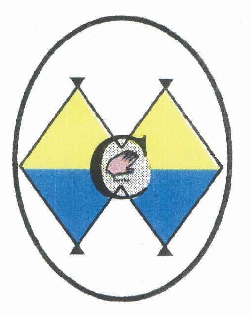
Legend of the Club Logo
The original Moultonborough Women’s Club Logo was designed by Betty Costello in 1998. The top is an “M” representing Moultonborough’s Golden Mountains. The bottom is a “W” representing Moultonborough’s Blue Lakes. The “C” in the center stands for “Club”. And the Hand has the word “Service” written underneath (in red) meaning “Service Club”.
The Gold represents Durability and Community
The Blue stands for Steadfastness and Loyalty
The Red is for Sacrifice
And the White is for Purity
In February of 1998, Betty won a contest for designing the new logo for the club.
In the design of the Quilted Banner, Betty was consulted and she asked that we improve the hand.
In October of 2012, Betty gave her nod to the slight changes to the logo that were required to accommodate the size of the banner.
Betty is pictured here with some of the Quilted Banner Committee Members: Mackie Heinrich, Trish Conley, Betty Costello, and June Hall on October 9, 2012
Other Committee Members Included: Joyce Lund, Gayle Russell, Dotti Simpson, Carole Smith, Cheryl Ulm, Sherry Weene, and Lynn Worth.
The MWC Logo is the centerpiece of the quilted banner which was completed in 2013 and presented to the club at the Annual June Banquet.
